In the ever-evolving realm of digital design, cascading style sheets (CSS) stand as a cornerstone for crafting engaging and responsive visual experiences. By mastering advanced CSS techniques, designers can ensure their creations are not only aesthetically appealing but also adaptable across a multitude of devices.
One powerful aspect of CSS is the use of flexbox. This layout module simplifies the process of designing dynamic, responsive layouts by eliminating the need for float or positioning hacks. With flexbox, you can effortlessly align items within a container, allowing for scalable layouts that work on any screen size. This capability is particularly essential when attempting to create a balance between aesthetic finesse and functional utility.
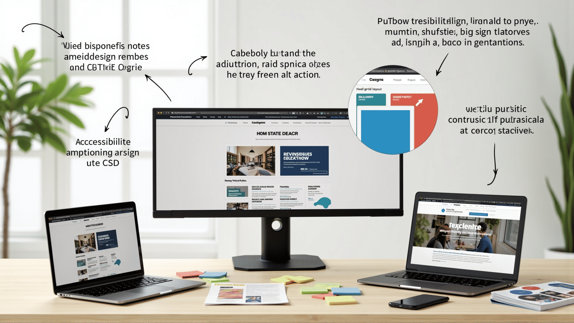
Grid layout is another CSS treasure, offering a two-dimensional system that enables complex layouts with minimal effort. By defining rows and columns, designers can place elements precisely on a page. The grid system is highly flexible, making it ideal for responsive design as it can easily adjust to fit different screen dimensions. It works in harmony with media queries, allowing for seamless transitions between different layouts on different devices.
Speaking of media queries, they are an indispensable tool in the CSS toolkit. They enable designers to apply styles based on the characteristics of the device, such as its width, height, orientation, or resolution. Media queries ensure that a design remains consistent and accessible across an array of platforms, providing users with a coherent experience whether they’re browsing on a smartphone or a desktop monitor.
Animations and transitions, when used judiciously, can significantly enhance user interaction by adding a layer of dynamism and fluidity to the visual presentation. CSS allows designers to animate elements with precision, transitioning properties like color, size, position, and more. These features can engage users and guide them through the content effectively without overwhelming them.
Variables in CSS bring a new level of efficiency, enabling designers to store values that can be reused throughout the stylesheet. This approach not only minimizes redundancies but also streamlines updates, as changing a variable's definition automatically updates all references. This makes maintaining styles easier and more efficient.
Utilizing CSS preprocessors such as SASS or LESS can further enhance a designer’s workflow. These tools introduce features like nesting, mixins, and functions, which help in creating more organized and modular code structures. Preprocessors compile into normal CSS, ensuring compatibility while providing additional functionality during development.
Responsiveness and accessibility should always be at the forefront of any design strategy. CSS plays a critical role in ensuring accessibility by enabling designers to implement features that support users with disabilities, such as high contrast modes, focus outlines, and adaptable typographic hierarchies.
In summary, mastering advanced CSS techniques empowers designers to create compelling and efficient visual narratives. As digital landscapes continue to evolve, so too do the tools and methods available in CSS, driving the pursuit of innovation and creativity in crafting experiences that resonate across diverse audiences and devices.