Creating an effective digital page layout begins with understanding the fundamentals of HTML. Essential for structuring the content and ensuring a seamless user experience, HTML provides the framework that supports visual and functional elements. This guide explores the key aspects of HTML layout that help in crafting clear and organized designs.
Basic Structure of an HTML Page
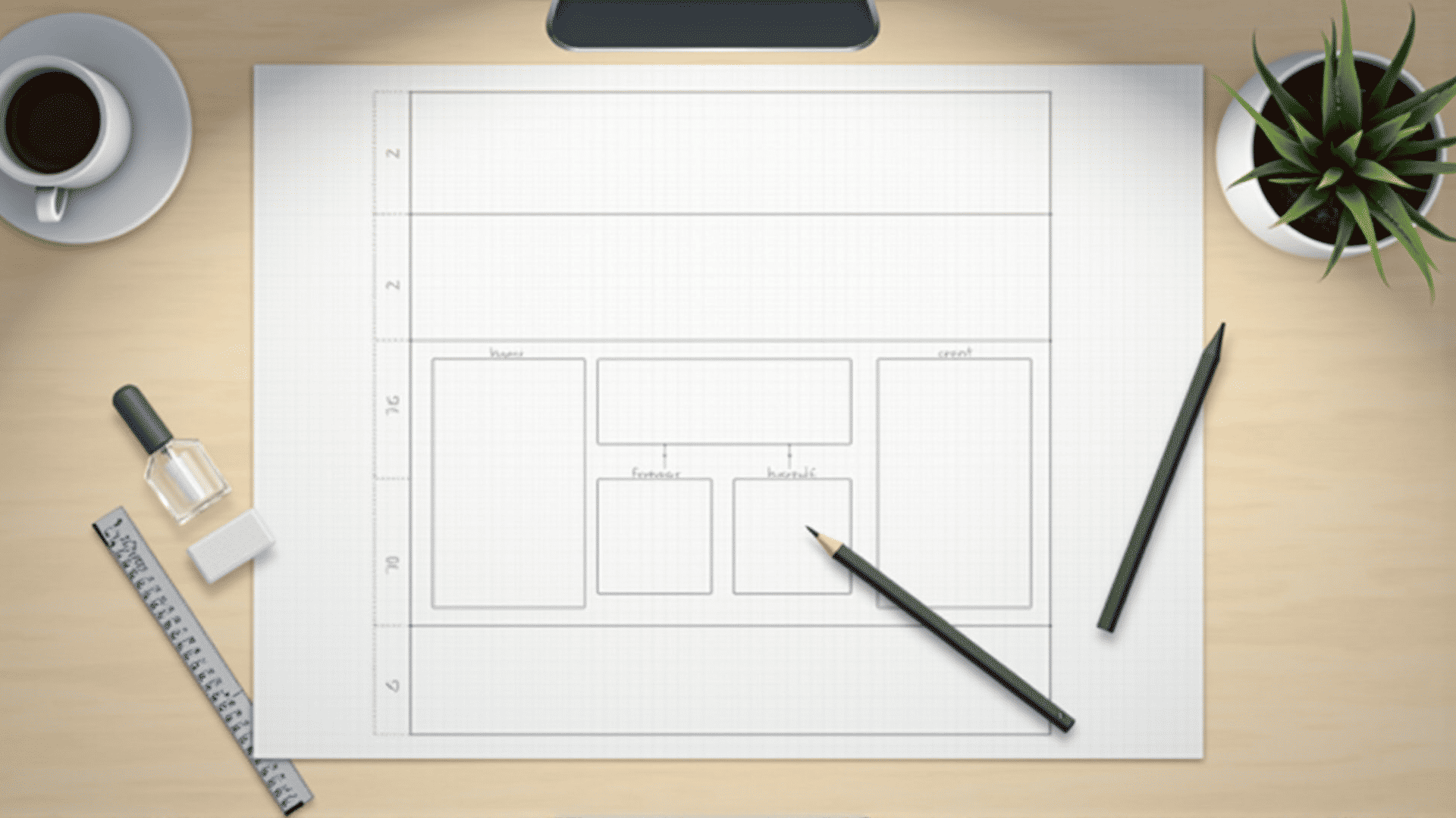
Every digital page starts with a basic HTML structure, which includes the declaration, followed by the , , and tags. The head section contains metadata, while the body includes the content visible to users. Properly structuring these elements is vital for both functionality and compatibility across different platforms.
Utilizing Semantic Elements
Semantic elements like , , and enhance accessibility and provide meaning to the page content. These tags not only help search engines understand the structure of the content but also improve the experience for individuals using assistive technologies.
Organizing Content with Div and Span
The Creating flexible and responsive designs is possible through CSS Grid and Flexbox. These tools allow for the arrangement of content in rows and columns, adapting to various screen sizes and orientations. They offer control over the alignment and distribution of space within a container, making them integral to modern layout strategies. Responsive design ensures that a digital page looks good across all devices. Utilizing media queries in CSS allows for the adjustment of layouts based on screen size, resolution, and orientation. Ensuring that images, menus, and other elements scale properly helps enhance the user experience. Links play a crucial role in connecting different resources. By ensuring all internal and external links are clear and intuitive, you can guide users through their digital journey seamlessly. Incorporating descriptive link text enhances accessibility and helps users navigate without confusion. Forms and interactive elements like buttons are fundamental for user interaction. Proper use of the Finally, testing the HTML code across different browsers and devices is crucial. Tools for validation and debugging help in identifying and resolving errors, ensuring that the page functions correctly. Cross-browser compatibility ensures a wider reach and a consistent user experience. By mastering these HTML layout essentials, you can create functional, accessible, and aesthetically pleasing digital designs. These principles not only improve the visual appeal of an interface but also enhance user interaction and satisfaction. tags are non-semantic elements used primarily for styling purposes through CSS. While is an inline element for styling specific parts of text. Using these elements wisely leads to more manageable and adaptable layouts.
Grid and Flexbox for Layout Design
Responsive Design Techniques
Linking Internal and External Resources
Enhancing UX with Input and Interactive Elements
, , and other related tags ensures that collecting user information is both secure and efficient. Additionally, employing JavaScript can enhance these interactions for a dynamic experience.Testing and Validation